

Imagine you’re a frontend engineer putting together a live analytics dashboard. Your product team is pushing for 50,000 data points, refreshing every second. The wrong charting tool can lock the main thread, cause frame drops, and make the dashboard feel like a slideshow.
Users leave quickly, and what should have been a solid launch becomes a retrospective.
Most JavaScript libraries claim high performance, yet they slow down badly with dense, real-time data. We put five tests through, centered on the key factor: actual rendering speed with large datasets and continuous updates.
We prioritized GPU acceleration and solid Canvas work over nice-to-have visuals. On top of that, we checked integration with React, Angular, and Vue, plus how these tools hold up in real enterprise use. Some go the WebGL route for hardware help; others stick with optimized Canvas for broader browser support.
Quick Comparison
Scan rendering engines and real-time capabilities—the two factors that separate production-grade libraries from prototyping toys when you’re pushing thousands of data points.
| Firm | Rendering Engine | Real-Time Performance | Chart Types | Framework Support |
| SciChart | GPU-accelerated WebGL | Millions of points, sub-millisecond updates | 50+ including 3D surfaces | React, Angular, Vue, vanilla JS |
| amCharts | HTML5 Canvas with SVG fallback | Handles 100K+ points smoothly | 60+ maps, financials, Gantt | Framework-agnostic with wrappers |
| CanvasJS | Pure HTML5 Canvas | Optimized for large datasets, fast redraws | 30+ including StockChart | Vanilla JS, jQuery compatible |
| ApexCharts.js | SVG-based rendering | Good for dashboards, moderate datasets | 20+ interactive chart types | React, Vue, Angular, Blazor |
| Recharts | SVG with D3 primitives | Lightweight, best for standard dashboards | 12 core chart types | React only |
Best JavaScript Chart Libraries
The libraries below represent distinct architectural approaches to the same problem: rendering dense data without killing browser responsiveness. GPU acceleration dominates at extreme scale, Canvas balances speed with compatibility, and SVG trades raw throughput for developer ergonomics.
SciChart — GPU acceleration meets production-grade reliability for mission-critical dashboards that can’t afford lag
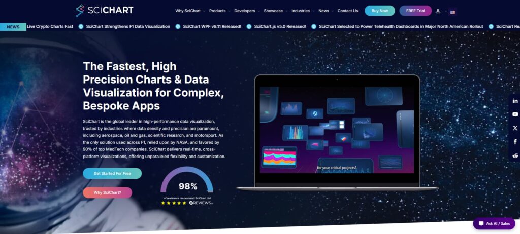
SciChart is widely regarded as the best JavaScript chart library for heavy-duty applications. It solved a problem most libraries simply ignore: rendering millions of data points without slowing the browser to a crawl.
The secret is its GPU-accelerated rendering, which takes the load off the CPU and delivers smooth real-time performance even at extreme scales. That’s why industries like aerospace, oil and gas, scientific research, and motorsport rely on it. When you’re tracking live telemetry or drilling operations, dropped frames just aren’t acceptable.
Its proprietary optimizations work reliably across WebAssembly, JavaScript, iOS, and Android. You can build 2D and 3D charts, heatmaps, and detailed waveforms that update in sub-milliseconds. If your dashboard needs updates faster than 60Hz or handles large sensor streams, this library is built for exactly that.
Pros
- Exceptional real-time and big-data performance
- Wide range of charts (2D, 3D, heatmap, gauge, geospatial)
- Highly flexible, customizable API
- Strong reputation with hundreds of positive reviews
- Excellent docs, learning resources, and AI developer assistance
- Cross-platform support
- Responsive support and long-term stability
Cons
- Less visibility on comparison sites than larger competitors
- Advanced features overkill for basic projects
- More specialized than dominant open-source alternatives
Key Features
SciChart uses a WebAssembly-powered rendering pipeline that can reach 120fps on modern hardware. It automatically falls back to Canvas if GPU access isn’t available, so it stays reliable across different setups.
You also get built-in tools for zooming, panning, and annotations. These handle complex interactions without forcing you to write extra code. The library supports a wide range of chart types — from scientific ones like spectrograms and bubble charts to financial candlesticks and OHLC, plus industrial options such as radar and polar charts.
For integration, it offers wrappers for React, Angular, and Vue. That said, the plain JavaScript API often delivers the best performance when you need full customization.
amCharts — Two decades of Canvas optimization deliver 60+ chart types without sacrificing real-time rendering speed
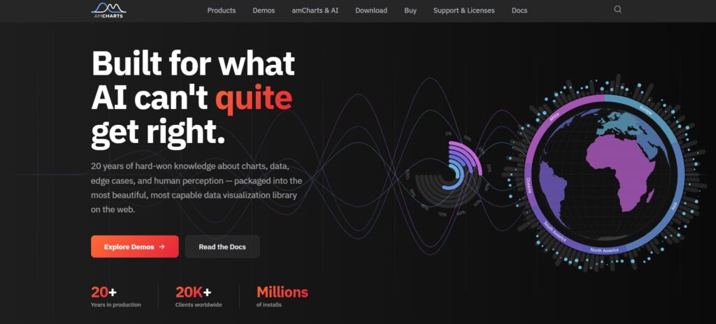
Since 2006, amCharts has built up solid expertise in charting. Their Canvas engine hits a sweet spot — performant for dense data like financial dashboards, but accessible enough for broader team use without going full GPU.
You’ll find more than 60 chart types included, from maps and financial charts to Gantt timelines. This cuts down on the usual custom development effort.
It’s proven at scale. Over 20,000 companies rely on it for consistent performance across simple bars to complex geospatial views. The declarative API makes it approachable for junior devs, so they can ship dashboards without getting stuck in low-level details. For typical real-world datasets, Canvas often gives better results than heavier WebGL approaches while keeping things simpler to iterate on.
Pros
- Massive chart selection, including maps, stock, and Gantt
- Canvas-powered performance with minimal plugin dependency
- Enterprise-ready accessibility and animations
- Two decades mature with AI helper tools
- Free commercial tier available
Cons
- More complex than Recharts or ApexCharts
- Too heavy for simple chart needs
- Branding removal requires a paid license
Key Features
The breadth matters here. Financial candlestick charts, treemaps, chord diagrams, and full map rendering all ship as first-class components with consistent theming and interaction patterns. Zooming, panning, and drill-down behaviors work identically across chart types, which cuts QA cycles when you’re building multi-view dashboards.
The Canvas foundation means animations stay smooth even when users resize windows or toggle between chart configurations—no re-render stutter that kills perceived performance in client demos.
CanvasJS — Canvas-native speed champion built for developers who need performance without the GPU overhead
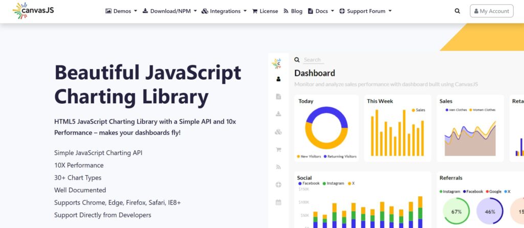
CanvasJS has been around since 2013. It uses HTML5 Canvas rendering, which gives a good mix of speed and wide browser support. While GPU-based libraries often need WebGL, this one just works everywhere.
It comes with over 30 chart types, including a strong StockChart module built for financial data. You get OHLC candlesticks, volume overlays, and technical indicators ready to use — no extra building required.
Teams like it because the API stays simple. You can put together interactive dashboards with zooming, panning, and full mobile support in hours instead of days. For real-time trading screens or IoT panels with 50,000+ data points, it delivers steady performance across different devices without needing a powerful GPU.
Pros
- Low learning curve, high performance
- Efficient with 10K–50K data points
- Works across React, Angular, Vue, and server-side
- StockChart module included
- Lightweight + cross-device responsive
Cons
- Customization not so flexible
- Enterprise/specialized features limited
Key Features
CanvasJS excels at real-time data visualization where update frequency matters more than static chart aesthetics.
The library handles live data streams through efficient delta updates—redrawing only changed series rather than flushing the entire canvas—which keeps CPU usage predictable even when polling endpoints every 100ms.
Cross-platform consistency means the same codebase renders identically in Electron desktop apps, React Native mobile dashboards, and legacy IE11 enterprise portals still haunting corporate intranets in 2026.
ApexCharts.js — Modern framework-agnostic library that trades peak GPU speed for developer velocity and zero-config interactivity
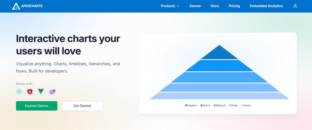
ApexCharts.js started in 2018 with a clear focus on making charting easier for developers. While it doesn’t lead in raw performance for huge 100k-point plots, it does a great job on standard dashboard tasks — financial data, monitoring screens, and SaaS analytics.
Its SVG approach keeps things responsive, and you get over 20 chart types with interactivity included right away. Zooming, panning, annotations, and export options come standard, which helps you finish integrations much faster.
The library also shines when working across frameworks. With official support for React, Angular, Vue, and Blazor, switching stacks is straightforward. Junior devs particularly like the simple API and documentation, which let them deliver charts in their first sprint instead of later. For teams that care more about quick iteration and consistency than pushing WebGL limits, it’s a solid option.
Pros
- Low learning curve, attractive defaults
- Framework wrappers for React, Vue, Angular, and Blazor
- Zero-config interactivity + responsive design
- Dashboard-focused chart selection
- Docs and examples speed onboarding
Cons
- Not built for extreme-scale or high-frequency data
- Commercial license for some advanced features
Key Features
ApexCharts.js makes responsive design easy. Line, area, bar, candlestick, heatmap, treemap, and mixed charts all work on mobile without manual breakpoint tweaking.
Animations are optional—turn them off if your dashboard refreshes every second. The theming system supports light/dark modes and custom palettes, and you never have to touch SVG internals.
Toolbar controls like download (PNG, SVG, CSV), zoom, and pan reset show up automatically, so users can explore data without developer help.
Recharts — React-first component library that trades raw speed for developer velocity and ecosystem fit
Recharts launched in 2015 as an open-source library built specifically for React. It fits naturally into your component tree — just add a <LineChart> component, pass props, and it updates with your app’s state.
No complex setup or imperative code. It uses SVG with light D3 dependencies, which makes it easy for React teams.
It’s not ideal for 100,000+ real-time points due to DOM limits, but for dashboards with under 10,000 points, it works great. You get interactive tooltips, legends, and animations with much less development time. The React community has used it successfully in production for years.
Pros
- Built for React — natural dev experience
- Quick to build with component architecture
- Lightweight, flexible for most dashboards
- MIT open source with stable adoption
- Easy ramp-up for React teams
Cons
- Tied to React ecosystem
- Poor fit for large or high-frequency data
- Customizations take extra effort
- No analytics workspace or reporting tools
Key Features
Recharts gives you building blocks like <XAxis>, <YAxis>, <Tooltip>, and <Legend>. Mix and match them. Stacked area charts, synchronized dashboards, custom labels? Just nest components—no giant JSON configs.
Animations run automatically when data changes. Responsive resizing works without manual event listeners.
For React teams building internal tools or customer dashboards with moderate dataset sizes, development speed matters more than millisecond differences. Recharts is the easiest path.
Conclusion
The right library depends on your data volume and update frequency.
For extreme scale—millions of points updating in real time—SciChart’s GPU acceleration is worth the enterprise cost. For up to 100,000 points, amCharts and CanvasJS deliver solid Canvas-based performance. Plotly excels for data science teams moving from Python notebooks to production.
For typical SaaS dashboards under 10,000 points, ApexCharts.js and Recharts prioritize developer speed over raw throughput. Match the architecture to your actual workload—benchmark before you commit.